
Dactile Meta: Notes on Site Design and Style
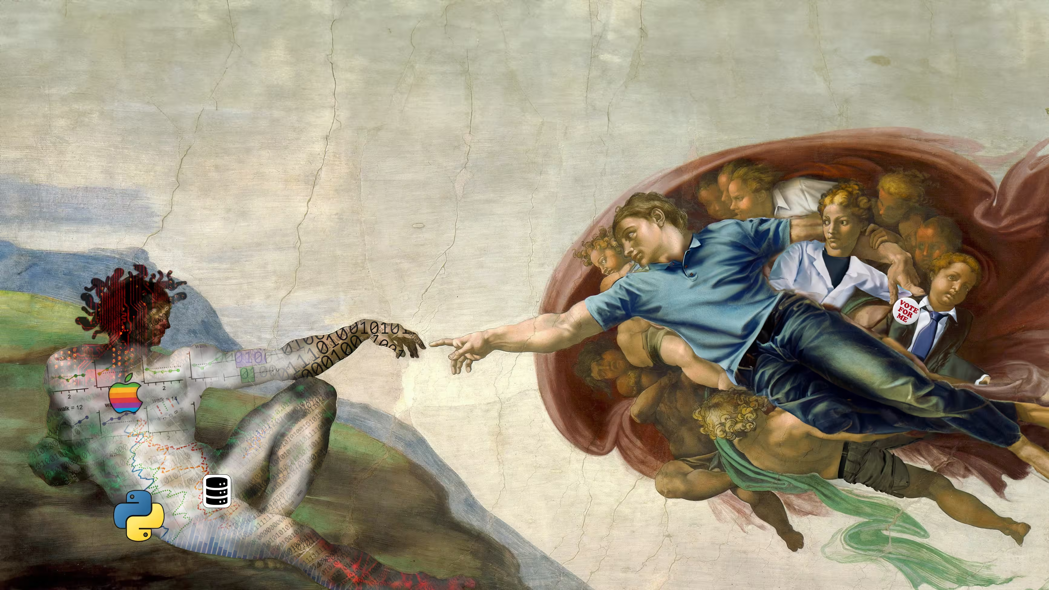
By David Gros. . Version 0.1.0 This page documents some of the design choices and features of this site. It is written as a collection of notes to be updated over time. Dactile's site design is intended to slowly work towards borrowing some of the best ways of communicating ideas online. By collecting ideas together here it hopefully helps iterating towards better design, and serves as guidance for others working on similar projects. This page might later be collected into a more prescriptive/didactic article once it is more mature. Additionally, this post is the first of what is planned to be daily postings throughout November 2025 (a bit in the style of NaNoWriMo). I spent most of November 1st improving some of the behind-the-scenes site infrastructure and setup rather than writing a new article. This page gets something new online for November 1st, with hopefully more to come. Dactile is coined as a "blog about data, technology, and the future", intended to be broad enough to capture a lot of different topics, while still giving a rough sense of the content. The name comes from a portmanteau of "data" and "tactile". It's a playground for smaller projects which seem interesting to explore, but aren't really full research papers or I wouldn't have much excuse to look at otherwise. Dactile is written somewhere between conversational writing and academic writing. Exactly where on the spectrum we land depends on the article and intended audience. Concretely this means using academic elements like "academic we" and generally a fairly formal register. This style is concise and lends itself to lower ambiguity. At the same time, some informal language, first-person anecdotes or personal opinion, and a bit of general handwaving is fine. Most articles assume the reader has some familiarity with current trends in technology, but usually not specific specialization of knowledge. Some articles might be more general audience. The initial base of the site is Tufte.css, a template created by Dave Liepmann inspired by the books of Edward Tufte. It inspires some of the formatting like the left justification with sidenotesWhich puts extra text nearby (when on desktop) and the typography of the site. Some inspiration is drawn from Distill.pub which starting in 2016 did a lot of innovation in creating beautiful, web-first academic writing. Similarly, Transformer-circuits.pub, which is Distill's partial successor from Chris Olah et al., gives continued inspiration on how to publish machine learning papers in a web-first format. In addition to these newer platforms, there are ideas to borrow from older media. LaTeX is the most popular way articles are written in fields like mathematics and computing. We adapt ideas here like using bibtex for creating citations, and simple concepts like including autoincrementing section/subsection numbers (a feature that Transformer-circuits frustratingly omits, making it difficult to discuss the work with others). We adopt There are many other websites which have great features that enhance the user experience. I hope to expand this section and integrate other ideas. Currently the site is generated in Python, generally based on Jinja with some custom plumbing and authoring in MDX. Each article is rendered into static pages. This can in theory have advantages for web performance compared to more dynamic designs (though dynamic pages can be highly optimized), but also is done to meet a design choice that each article is atomic. Like a PDF article or a printed book, updates to old articles should only happen if intentional. This in contrast to some website designs where say parts like the header, footer, and general style or components of the page might change to stay consistent across the site. We are ok with changes not applying to old articles, as it simplifies the continuous evolution of the site, without having to make sure old articles do not break. However, as a result some of the features on this page might not be found on every article. Additionally, we want to keep version history or notes of any edits, both for intellectual integrity and for easier reference. This section is intended to highlight some design elements that I personally enjoy or think are neat. The landing page image is an adaptation of "The Creation of Adam" by Michelangelo which adorns the ceiling of the Sistine Chapel. The adaptation was made digitally in 2024 using Photoshop. Michelangelo's piece depicts God giving life to Man. My adaptation depicts Man creating a personified representation of technology / AI. On the right side, the face of Adam is mirrored, depicting how Man is playing God through creating a new set of powerful technologies. God's tunic is replaced with a shirt and jeans, in a Silicon Valley business casual fashion. The various figures are also altered. Art scholars debate who is the woman to the right of Michelangelo's God (possibly Eve, Virgin Mary, or just general female figure). In the adaptation she is clothed in a lab coat, her scowling expression fitting an unease of the scientific and medical community with growing AI technology they are not necessarily directly creating themselves, but is impacting their field. A figure to the right is fashioned to be a politician with averting eyes and confusion over the challenges of powerful technology. On the left we see the creation. Binary 1s and 0s spring from its hand like the data that underlies modern computing. Tattoos of data visualization cover the body. The classic 1977 Apple Logo is centered over the heart, combining both the heritage of a modern computing giant with the biblical forbidden fruit. The Python logo connects both the most popular programming language with the serpent of Genesis. Big data helped seed modern AI and technology, and a bit cheekily a database logo is used as a censor on the groin. Green and evil shadings compete to take over the creation, representing the challenging good and evil dual use of technology. While the face is a mirror of the creator (Man), the monstrous tentacles emanating from the headA partial reference to the "Shoggoth Meme" in which LLM systems are depicted as weird alien creatures with small friendly face on top after training. hint that it might not be as simple a reflection of Man as we might hope. The adaptation includes some outpainting (adding extra texturing above) in order to better go fullscreen on desktop and mobile. It's not perfect and certainly no masterpiece, but I'm generally happy how it came out and had fun making it. The first post had an image of a pineapple in on the top, and have kept that going in subsequent posts. Having a "mascot" / personificaiton of the blog seems good for both the whimsy and the brand consistency. Future work is needed to get a good process for making these. The site and this page will likely evolve over time. I would conclude here with inviting feedback or discussion on site design elements people really enjoy. However, a feature for comments is still TBD :). Until then, I hope you independently found some interesting elements in these notes.
Introduction. What is Dactile?
Style
Writing Style
Inspiration and Prior Works
(author, year) style citations to give a slightly academic tone and make it easier to reference cited work multiple times. We slightly decrease the font size of the citations to use less space. In some articles we have used small inline link icons similar to those found on gwern.net for links that are not traditionally cited by author name (eg, Wikipedia). The automation of this process is still a small feature to be added. In addition, we need better handling of general web links in the bibliography section.Technical Backend
Notable Design Items
"The Creation of Dactile"

The Dactile Pineapples
Conclusions